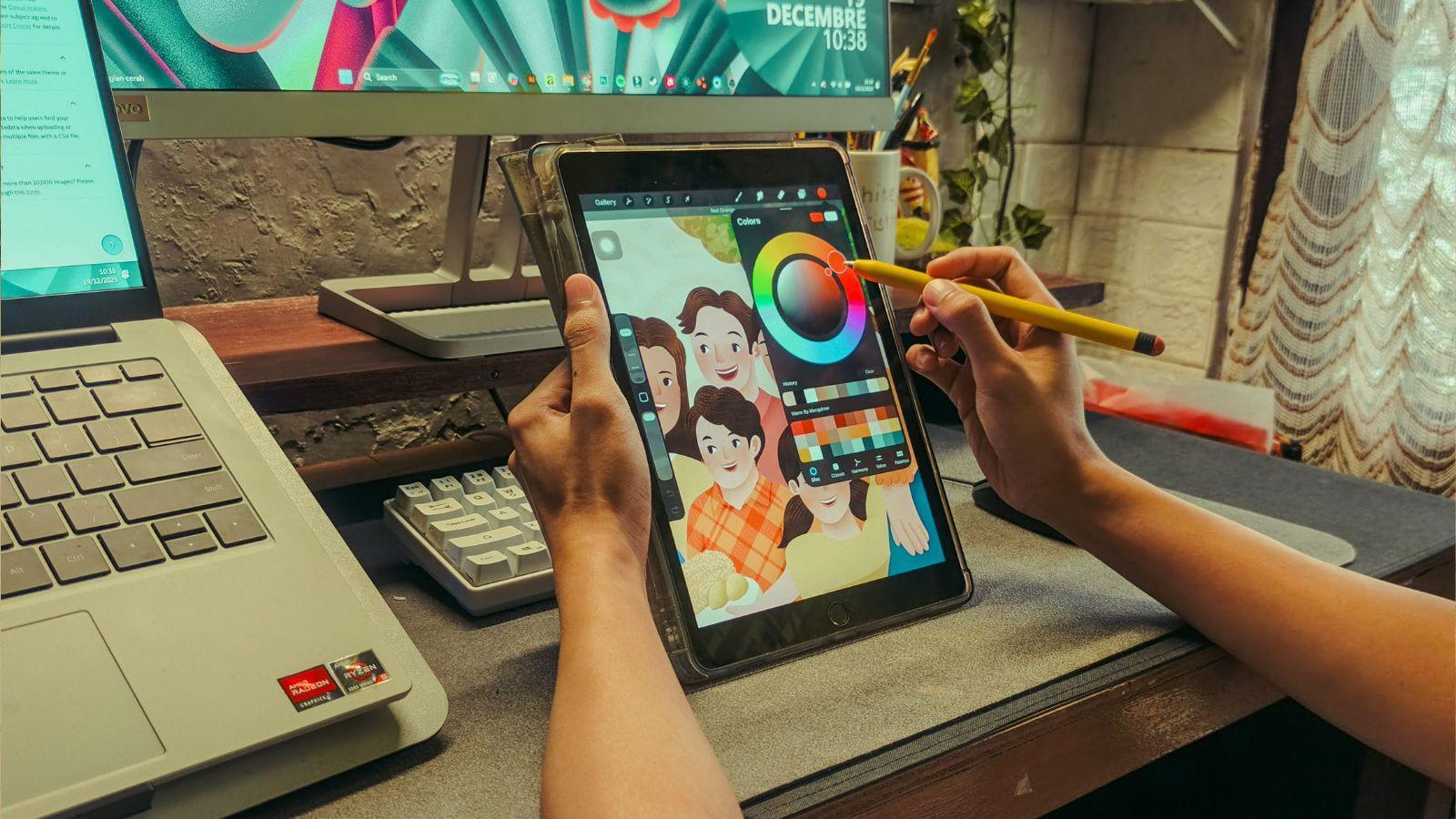
A memorable visual world does more than look pretty. It gives you a feeling before you’ve read a line of dialogue, pressed a button or worked out exactly what you’re looking at.
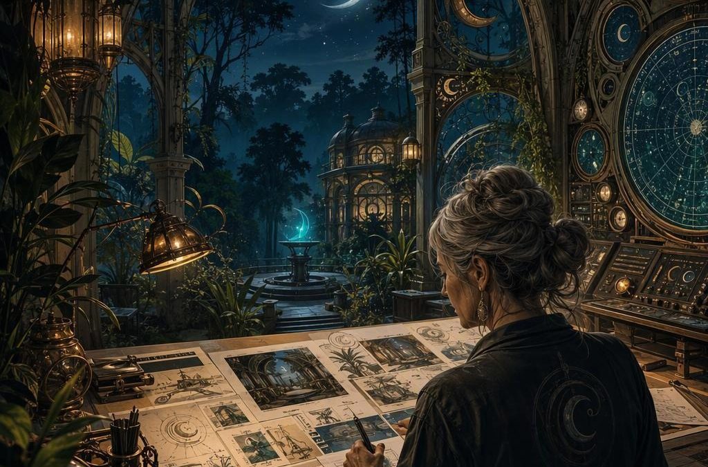
Think of a moonlit forest painted in blue-green shadows, a neon city humming with pink signage, or a sunny seaside scene built from faded posters and hand-drawn lettering. The colour, shape and texture all work together to say something. You’re not simply viewing an illustration, you’re stepping into its rules.
That’s why colourful, themed worlds remain so effective across contemporary digital art. Whether the work appears in an editorial illustration, a character sheet, a moving interface or an interactive experience, the strongest pieces feel intentional. Every visual choice appears to belong.
Building that sort of unity takes more than picking a fun palette. It comes from a clear visual language, repeated with enough variation to keep the eye interested.
The building blocks of a convincing visual world
Before an artist adds fine detail, there needs to be a foundation. A world can be wildly imaginative, but it still needs its own internal logic.
Colour sets the emotional temperature
Colour is usually the quickest route into a theme. Warm oranges, reds and golds can make a scene feel celebratory, ancient or sun-baked. Cooler blues and violets often suggest distance, night, mystery or technology.
The trick is not to use every colour at full volume. A limited palette often makes an illustration feel more confident.
Try thinking in roles:
- Dominant colours establish the overall mood
- Supporting colours create depth and variety
- Accent colours direct attention towards important objects, characters or controls
- Neutral tones give the eye somewhere to rest
A striking accent can be tiny. One glowing turquoise eye in a largely amber scene may do more work than a whole background filled with competing hues.
For a useful starting point, the colour theory overview from the Interaction Design Foundation explains how relationships between colours affect perception and usability.
Silhouette comes before surface detail
If you turn an illustration black and can still recognise the central character, vehicle or building, the silhouette is doing its job.
Strong silhouettes make visual worlds easier to read at a glance. A wizard’s pointed hat, a robot’s boxy shoulders or a strange plant’s curling leaves can communicate personality long before texture is added. This matters particularly in interactive art, where someone may only have a second to understand what is selectable, safe, important or decorative.
When sketching, it helps to shrink the image right down. If the main idea disappears at thumbnail size, simplify the shapes rather than adding more detail.
Composition tells the viewer where to look
Composition is the quiet guide behind a successful image. It decides what is revealed immediately, what sits in the background and where the eye travels next.
A few dependable tools include:
- Framing a subject with archways, foliage or architecture
- Using contrast to make a focal point stand out
- Leading lines, such as roads, beams of light or branches
- Leaving empty space around something important
- Repeating shapes to create rhythm
There’s no need for every composition to be grand or cinematic. Sometimes a character placed slightly off-centre against a calm background has more personality than a crowded scene.
Symbolism gives a world its private shorthand
Themed worlds become richer when motifs recur. A crescent moon might signify a particular faction. A cracked mask could hint at lost identity. A flower may appear in different forms across props, costumes and menus.
These repeated symbols create recognition. They also reward attention.
Environmental storytelling works in much the same way. A tipped-over chair, a half-finished mural or old posters peeling from a wall can suggest history without a single explanatory sentence. People are very good at joining visual dots, so give them something worth noticing.
How artists move from loose ideas to a coherent style
The finished image may feel effortless, but the route to it usually involves plenty of testing. A visual world is rarely discovered in one perfect sketch.
Start with a research board, not a finished answer
Research boards are useful because they let you gather references without copying any one source. You might collect photographs of weathered stone, vintage packaging, old astronomical diagrams, botanical forms, theatre lighting or street signs.
The point is to identify patterns:
- Which shapes keep appearing?
- Are the references soft and rounded, or sharp and angular?
- Does the world feel handmade, polished, worn, ornate or minimal?
- What materials belong there?
- What should definitely not appear?
A good board can also expose contradictions. If half the references are delicate watercolours and the other half are heavy industrial metal, you’ll need to decide whether that contrast is the point or whether the direction needs tightening.
Thumbnailing saves time later
Thumbnail sketches are small, rough and deliberately unprecious. They’re where an artist tests composition, scale and visual hierarchy before committing to a polished painting.
I find it useful to make several quick versions rather than defending the first decent idea. One sketch might focus on a dramatic skyline, another on a close character moment, and another on a simple symbolic object. At this stage, you’re looking for the clearest storytelling option, not the prettiest rendering.
Keep the drawings small enough that you can’t fuss over eyelashes, brick textures or decorative trim. If an idea works in miniature, it has a solid frame.
Character design should reflect the world around it
Characters shouldn’t feel as though they’ve wandered in from another project. Their clothing, posture, proportions and props ought to echo the setting’s visual rules.
In a nature-led world, for example, costume shapes may borrow from petals, bark, shells or wings. In a retro-futurist setting, you might use rounded helmets, chrome trims, oversized switches and optimistic geometric forms.
Ask a few practical questions:
- What does this character value?
- What environment have they adapted to?
- Which shape language belongs to them, circles, triangles, rectangles or a mix?
- What can their silhouette tell us without text?
- Which details are essential at a small size?
A character doesn’t need a huge backstory to feel real. A specific tool, unusual walk, distinctive colour pairing or worn badge can be enough.
Build a visual language, then repeat it with purpose
A coherent visual language is simply a set of creative rules. It may cover palette, line weight, texture, lighting, typography, ornament and animation style.
For example, your world might establish that:
- Edges are rough and inked rather than perfectly clean
- Highlights are always pale yellow, never pure white
- Magical elements appear as spirals and clustered dots
- Important interactive objects have a red outline
- Background figures use less contrast than foreground ones
Rules make decisions easier, especially when a project grows. They also allow you to break a rule deliberately when something genuinely needs to stand out.
Motifs that artists return to again and again
Some themes endure because they offer an abundance of visual material. They’re not shortcuts, exactly, but they do provide a generous starting point.
Mythology and fantasy
Myths bring instant symbolic weight: beasts, constellations, sacred objects, forgotten temples and transformations. The key is to go beyond familiar surface details.
Instead of merely drawing a dragon, consider the world that shaped it. Does it leave crystal formations in the landscape? Is its architecture built around its sleeping places? Do local patterns and garments resemble its scales?
Fantasy feels freshest when the setting influences everything within it.
Retro futurism
Retro futurism imagines what earlier eras thought the future might look like. It can be playful, wistful and wonderfully graphic, full of ray-gun curves, space-age type, control panels and bright, optimistic colours.
The appeal often comes from contrast. You get the clean geometry of old technology mixed with imaginative possibilities that never quite happened.
Visual references and print traditions
Pop culture can help audiences recognise a mood quickly, but it needs care. Aim for influence rather than imitation. A broad visual nod to a decade, genre or print style can be effective without reproducing protected characters, logos or distinctive assets.
Take the underlying design lesson instead. Maybe it’s the bold halftone texture, the dramatic framing or the limited print palette that interests you.
Nature-led design
Nature offers patterns that are difficult to improve upon: branching systems, shell spirals, mineral layers, insects, clouds and root structures. It can lead to work that feels calm, strange or both.
Look closely at variation. No two leaves are identical, but they share a family resemblance. That’s a useful lesson for designing repeated assets in any themed world.
Motion and interface clarity
A themed visual world doesn’t stop at the illustration. In digital experiences, it also needs to move and respond clearly.
Animation can reinforce a setting without stealing attention. A floating lantern may sway gently. A mechanical button may depress with a satisfying little shift. A magical border might shimmer when selected.
These are often called micro-interactions, and they work best when they answer a simple question: what just happened?
Keep movement readable:
- Use animation to confirm an action, not obscure it
- Make important buttons distinct from decorative elements
- Preserve strong contrast between text and background
- Avoid relying on colour alone to communicate meaning
- Give motion a consistent speed and personality
A playful interface can still be clear. In fact, clear interfaces give artists more room to be expressive because viewers don’t have to spend their time guessing what anything does.
The Web Content Accessibility Guidelines are particularly helpful when considering contrast, readable text and interaction feedback.
Applying themed art to mature digital projects
Interactive entertainment gives art direction a practical challenge: the theme needs to be appealing, but the interface must also remain legible. Designers may use character portraits, decorative frames, symbolic icons, animated backgrounds and carefully chosen palettes to establish a world quickly.
For UK adults aged 18+ interested in seeing how themed visual identities appear in a regulated entertainment setting, Virgin Games’ new online slots page can be used as a current-reference gallery of game-led art direction. Look at how a release uses theme, palette, iconography, character treatment and interface hierarchy, rather than treating the page as a promise of any outcome. Gambling is for adults only, and it should be approached with clear personal limits and responsible play in mind.
The useful design question is simple: could you identify the theme from one still image? If so, the visual system is probably doing its job.
A practical motif-analysis exercise for illustrators
Want to sharpen your eye? Pick a themed artwork, then spend fifteen minutes breaking it apart.
Create four quick lists:
- Palette: Which three colours dominate, and where is contrast used?
- Shapes: Are forms mostly rounded, angular, tall, squat, symmetrical or irregular?
- Symbols: Which objects repeat, and what might they suggest?
- Hierarchy: What do you notice first, second and third?
Then make a tiny redesign using the same structural logic but a completely different subject. If the original uses jewel tones, curved arches and crescent motifs, try translating that into an underwater market, a weather station or a botanical observatory. You’ll learn far more from the transformation than from tracing the finished look.
For further context, it’s worth exploring established resources such as the Tate’s guide to art terms and the Metropolitan Museum of Art’s Heilbrunn Timeline of Art History. Both are excellent reminders that visual languages have always developed through materials, symbols, social change and shared reference points.
The best themed visual worlds don’t rely on decoration alone. They make every choice, from a background cloud to a button shape, feel as though it belongs to the same imagined place. Start with a clear mood, give yourself a few strong rules, and leave room for the unexpected detail that makes people want to look twice.